Lindsey Roberts
GDD Diploma
Lindsey Roberts is a graphic designer who relocated from Alberta to Abbotsford to pursue her creative passion. Lindsey's love for art and design started early and has always been significant in her life and will continue to grow as a graduate of the Graphic and Digital Design diploma program at the University of the Fraser Valley. With a Women and Gender Studies degree from the University of Alberta, Lindsey uses graphic design as a tool for social justice. She believes designers have the power to make a positive impact on the world through visual communication. Lindsey creates designs with meaningful messages that promote social causes. Her adventurous spirit leads her to travel, hike, and kayak in her free time. Lindsey is eager to continue growing as a designer and see where life takes her next.
Dean's List 2021-2023
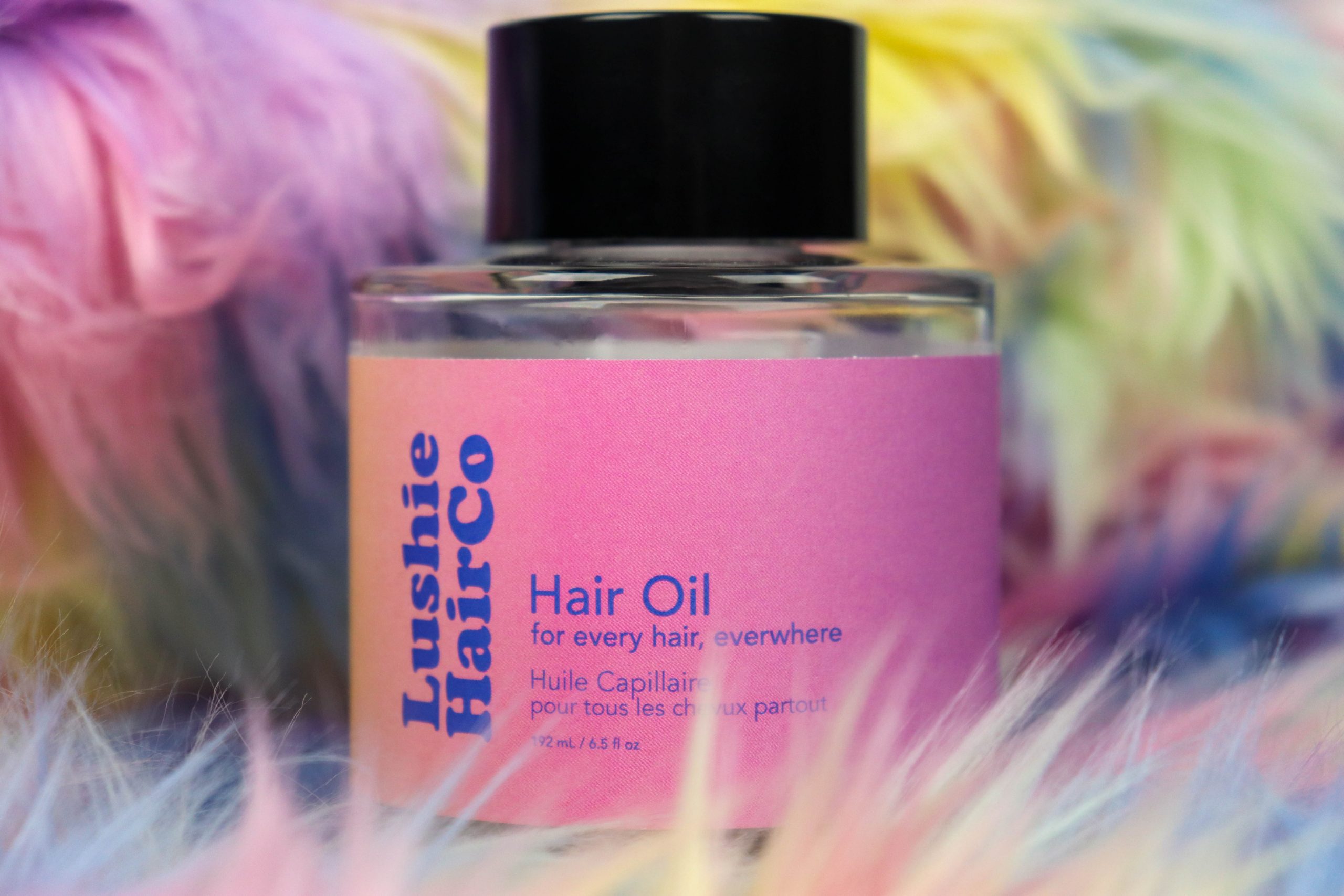
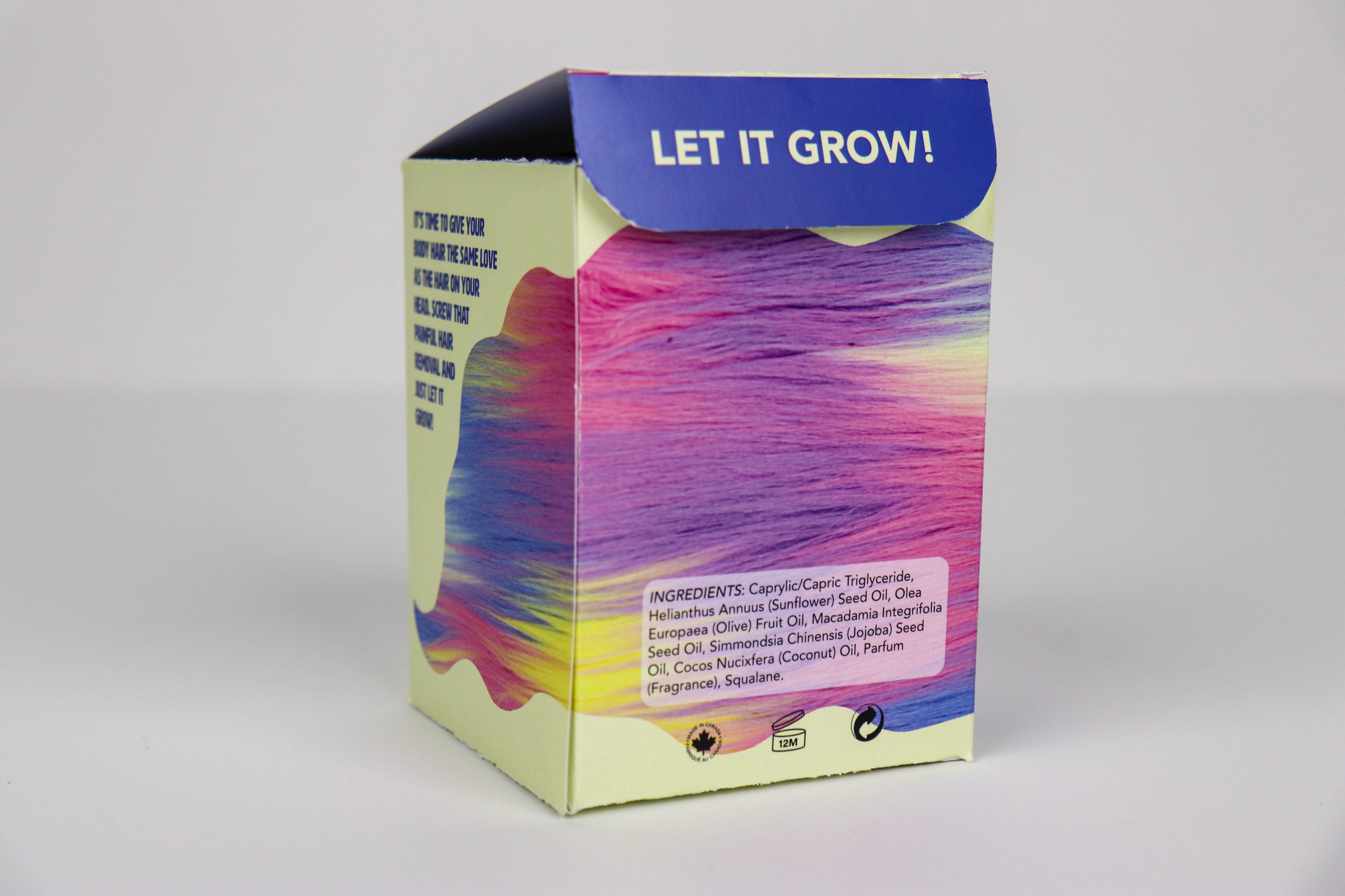
Lushie Hair Co.
Packaging
The packaging for a hypothetical product challenges societal expectations that women should remove their body hair to be considered beautiful. The product aims to nourish all hair on the body as one would on their head, and the design challenge was to make a visual statement through illustration. To attract consumers, the packaging should reflect the messaging of embracing body hair with clever copywriting and fun colours. The packaging's bubbly and carefree persona is meant to mimic how the person will feel when using the product. The target audience is young women aged 16-35, who feel the most pressure to conform to beauty standards, making the design particularly relevant and appealing to this demographic.
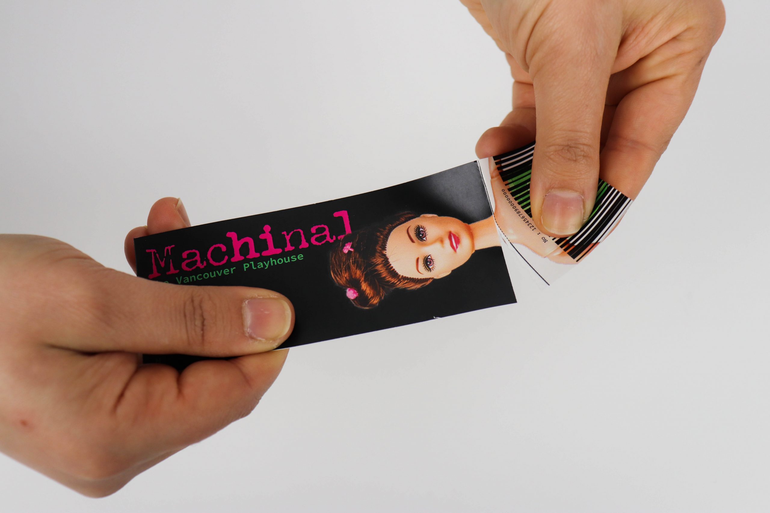
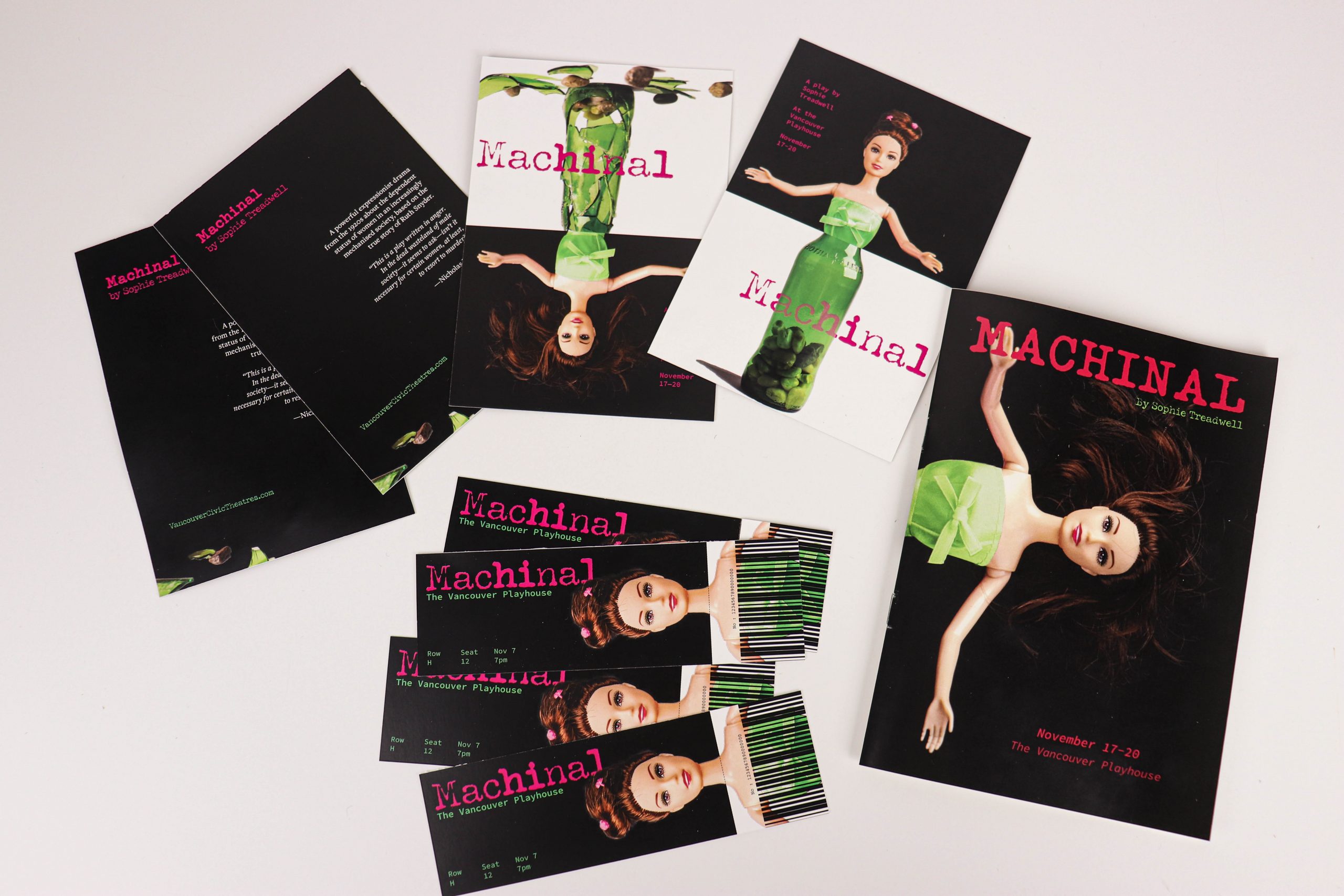
Machinal Play Promotion
Promotion
The task was to create promotional products for a theatre production of Machinal by Sophie Treadwell, a 1920s German expressionist play about a woman feeling trapped by societal expectations. The challenge was to make a visual statement about the expectations still placed on women, using consistent visual language throughout the series to evoke emotion. The inspiration was the idea that women were viewed as objects. The design used a visual metaphor of a doll and a bottle, representing the protagonist and the murder weapon. Combining the two represents the feeling of being stuck, conveying the play's themes. The design aims to provoke thought and create a memorable experience for the attendees using four touchpoints that follow the user journey from advertisement to attending the production.