A passionate and open-minded graphic designer, Taylor thrives on creative challenges and is always eager to step outside of her comfort zone. With a strong appreciation for collaboration, Taylor excels in team environments and finds inspiration in the diverse perspectives and ideas of others. Through her courses, she has rediscovered a deep sense of curiosity that continues to fuel her creative drive. Always motivated to learn and grow, Taylor embraces each project as an opportunity to push boundaries and explore new possibilities in design.
Now take a look at my work
Dean's List
2024
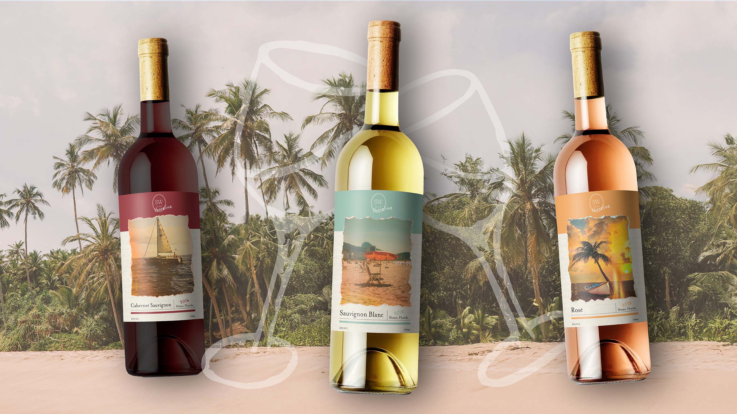
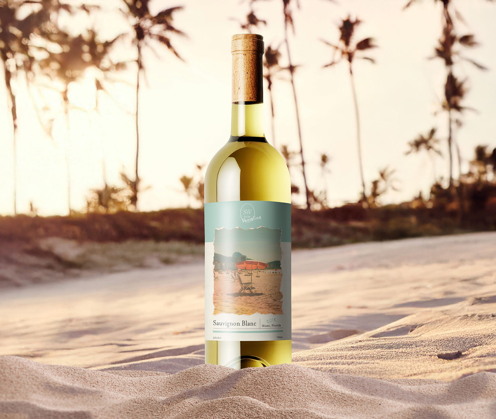
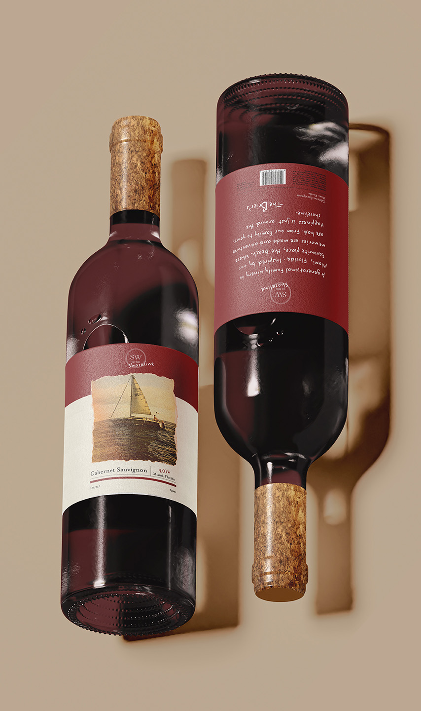
SHORELINE WINERY
The goal of this project was to create a winery and design three cohesive wine labels for a white, red, and rosé. Shoreline is a family-owned winery in Miami, Florida, rooted in the Brier family’s love for the beach. These designs blend tradition with a fresh, modern touch to honor each generation. A personal note from the Brier’s, found on the back of every bottle reminds you that: Happiness is just around the Shoreline.
I wanted the Shoreline designs to feel deeply personal to the Brier family, rooted in authenticity. Inspired by the idea of passed-down family photos, the main label features a scrapbook paper sort of material, with a family photo taken on a digital camera, complete with a date stamp, torn edges, and soft light leaks. These details create a nostalgic, well-loved feel, capturing the warmth of family legacy while tying into the winery’s story.
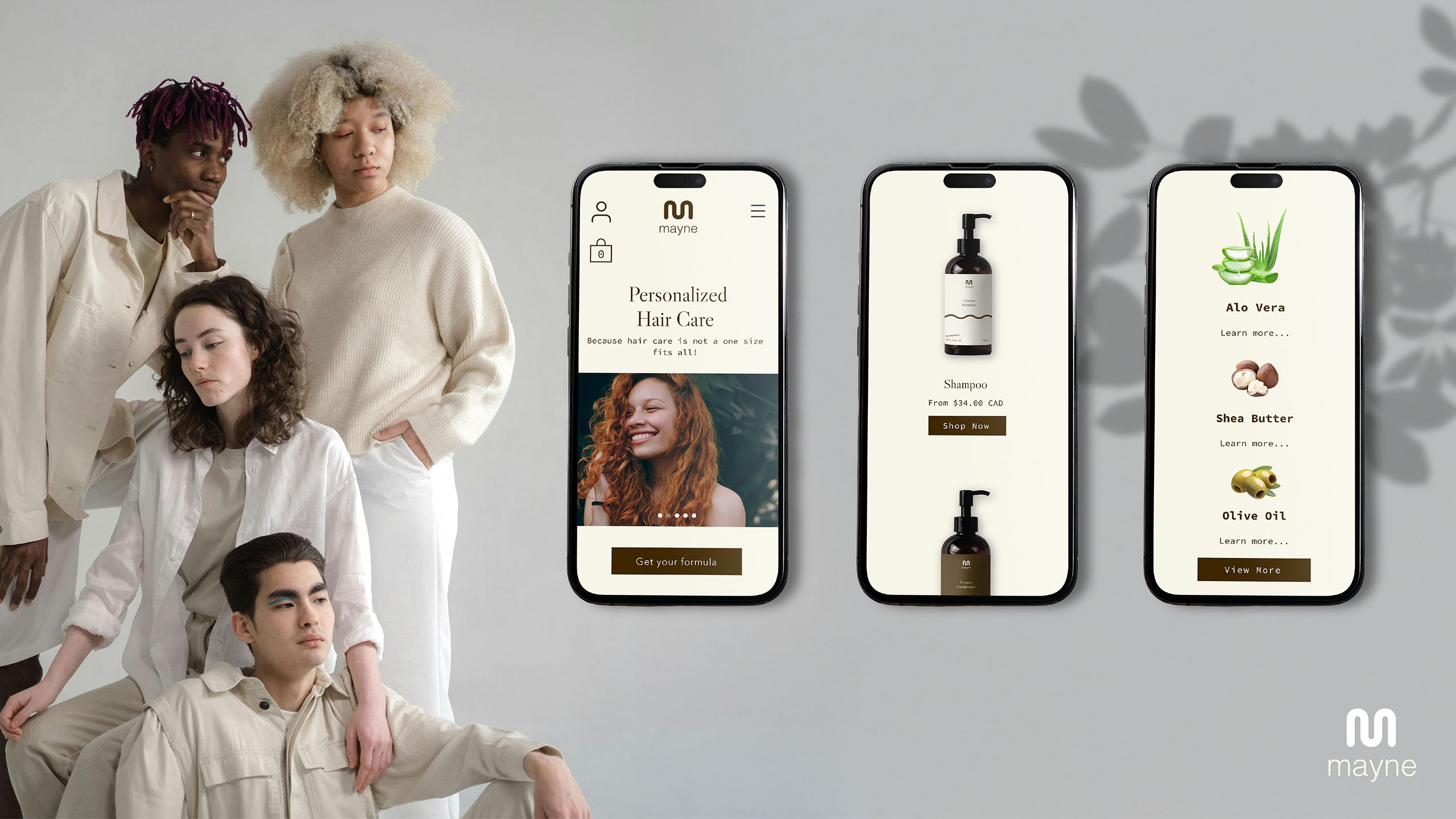
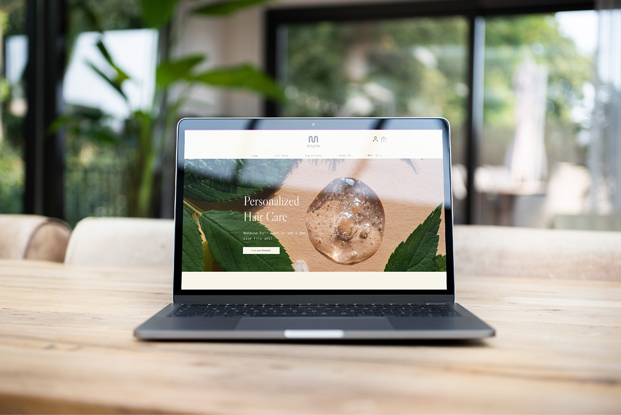
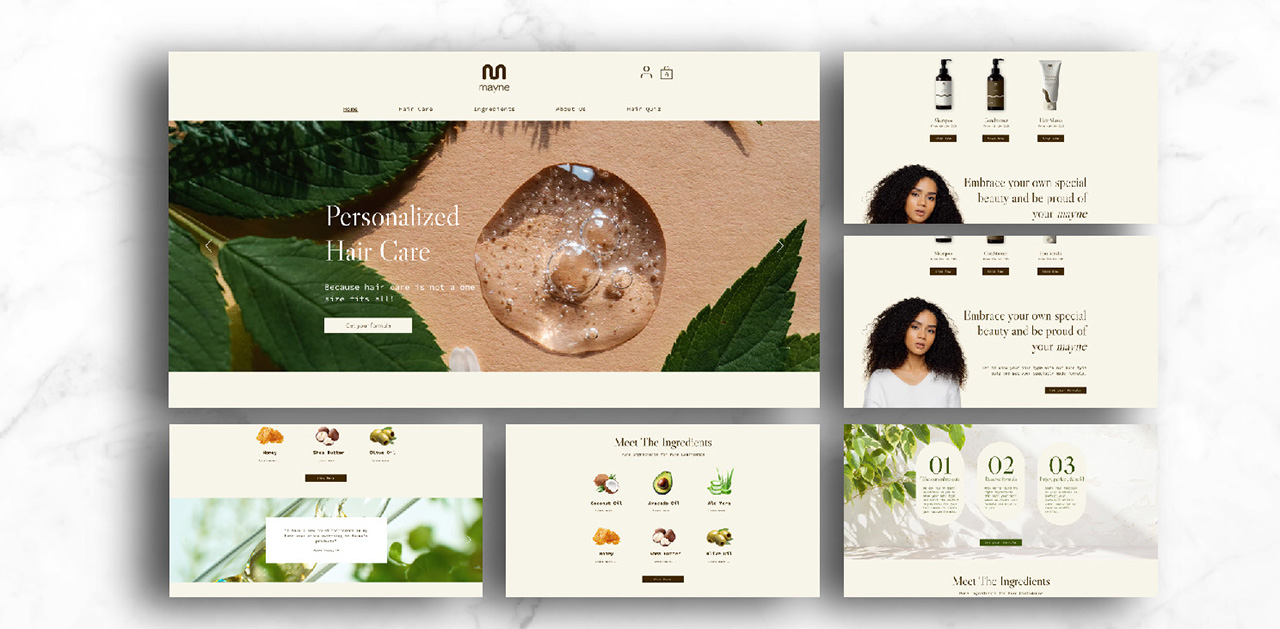
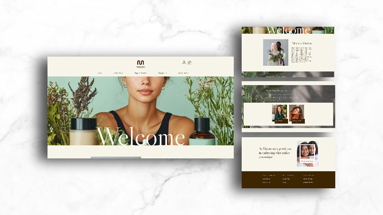
MAYNE HAIR CARE
Mayne is an inclusive, sustainable, and uplifting hair care brand developed during a group branding project, where I led the UX/UI design. Focused on clean, organic ingredients, Mayne offers customizable products through a personalized hair quiz. My goal was to reflect the brand’s values by creating a fresh, approachable website using natural tones and thoughtful design. The result is a digital experience that feels as clean and intentional as the products themselves.
To bring Mayne’s values to life, I used earthy tones, clean layouts, and botanical imagery to reflect its organic and sustainable mission. The homepage blends modern UX with a warm, inclusive aesthetic—featuring clear navigation, personalized product highlights, and engaging visuals. Every element—from typography to user flow—was thoughtfully considered to align with Mayne’s goal of empowering individuals through personalized hair care rooted in self-care and sustainability, while creating a user-friendly experience that communicates trust, freshness, and individuality.
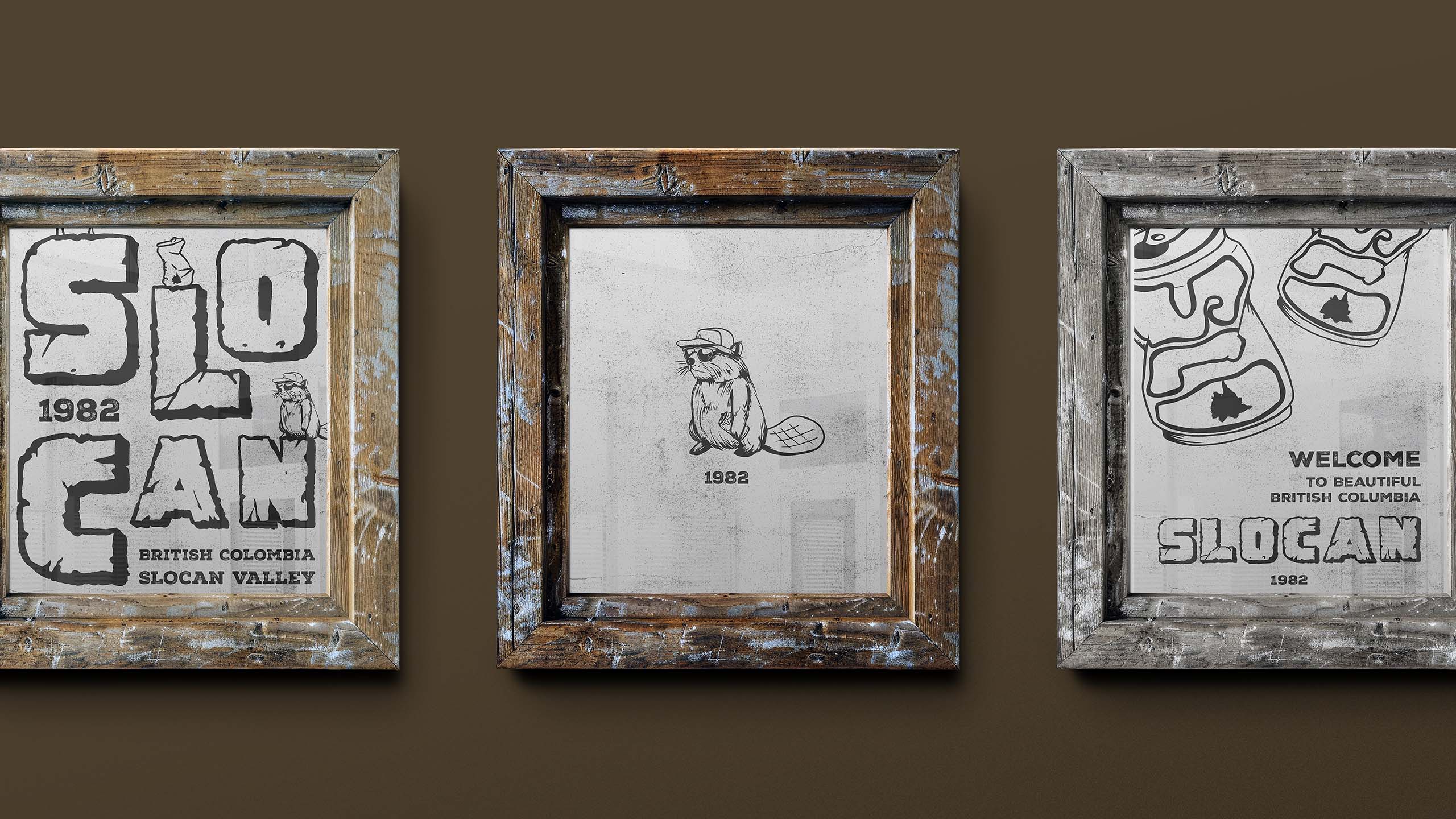
SLOCAN VALLEY
Slocan Valley was a design project for a family friend, a blue-collar tradesman from the Slocan Valley in the West Kootenays. Inspired by a sketch he made years ago—a shotgunned can with "Slo" to represent his hometown. I aimed to bring this drawing to life in a playful yet rugged way. Using earthy tones and textures, I captured the essence of the Canadian wilderness while adding a proud, personalized Canadian style for his own use.